Sirge — Analytics Dashboard
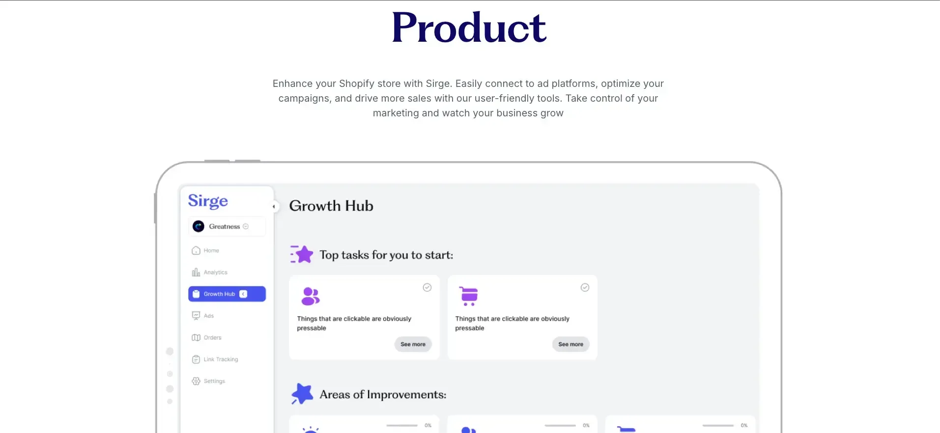
Built Sirge's analytics dashboard from scratch as part of a v2 rebuild — a daily-refreshed view of sales, ad spend, break-even ROAS, and top-performing products and channels, unifying data from Shopify, Meta, TikTok, and Google.
Role
Full-Stack Engineer
Timeline
2025
Outcome
Net-new analytics dashboard, core data foundation reused across the v2 rebuild
Status
Production
The problem
Sirge had no analytics dashboard. Clients could see individual pieces of their data scattered across the app, but there was no single place to answer the questions that actually mattered to them: is my ad spend working, which channel converts best, and which products are actually performing.
This wasn't a standalone feature bolted onto the existing app. It was part of a broader v2 rebuild of the product, and the analytics dashboard was one of the newly designed pieces of that rebuild. That meant the work wasn't just "build an analytics page." It meant rebuilding much of the application's core data structure first, with analytics as one of the primary consumers of that structure, then building the analytics layer on top of it, then the frontend components to display it.
The product team had already defined the scope and design for the analytics page itself: a dashboard summarizing sales, ad spend, break-even ROAS (return on ad spend), top-performing products, and top-performing ad channels, refreshed daily rather than in true real time. But getting there meant making foundational decisions about how the whole application stored and moved data, not just how one page would query it.
Discovery
With the analytics design already defined, the open question was entirely structural: how do you rebuild the application's core data layer so that any page, including a brand-new analytics dashboard pulling from several external sources, can trust the numbers it shows.
Our first approach for the core structure was to use MongoDB, chosen for fast reads, with each page in the app effectively getting its own collection. Early on, building the analytics layer on top of that structure surfaced real problems: data arriving from external sources didn't always come in clean. There was missing data, inconsistent formats, and gaps that needed active reconciliation, and a document-based, per-page storage model made it harder to guarantee that two different pages showing related numbers would actually agree with each other.
There was no ambiguity in what the metrics meant. The harder problem was making sure the core data structure itself was trustworthy enough for analytics, and everything else built on top of it, to rely on.
Constraints
- A 3-month deadline, working with one other engineer (backend and frontend split initially, though I later took over the frontend work as well).
- Multiple external data sources, each with its own rate limits, particularly the ad platform APIs, which ruled out any approach that meant hitting them constantly for near-real-time updates.
- Exact cross-page consistency required. This wasn't a dashboard that could show approximate numbers; it had to match the source-of-truth data used elsewhere in the app, precisely.
- A design already in place, which meant the engineering decisions were entirely about how to get the right data to the page reliably and fast, not what to show.
The decision
Building in layers: core structure first, analytics on top, frontend last. Because this was part of a v2 rebuild, I approached the work in a deliberate sequence: get the application's core data structure right first, since every other part of v2 (not just analytics) would depend on it. Then build the analytics-specific data layer on top of that foundation. Then build the frontend components to display it. Skipping straight to "build the analytics page" without settling the core structure first would have meant building on sand.
Batched and cached aggregation over real-time. I chose batched, cached aggregation over real-time polling for one clear reason: rate limits on the ad platform APIs. Real-time polling wasn't viable given those limits, and wasn't necessary either, since ad spend data itself doesn't update instantly on the platforms' end. Daily refresh, combined with conditional refreshes triggered under specific conditions, gave clients data that was current enough to act on without hammering external APIs.
A dedicated service to unify data from multiple sources. I built a shared service to pull in and store ad platform data (Meta, TikTok, Google). That same service also handled filling in any missing Shopify order data by cross-referencing the app's own order-ingestion table against the Shopify API directly, closing gaps rather than letting them silently produce wrong numbers.
Store data at its most granular, truthful form, then aggregate it. Rather than pre-computing and storing rollups (daily, weekly, monthly totals) as their own separate data, I kept the underlying data in its simplest, most granular form, with aggregation happening at the point of need. This meant the raw data was always the single source of truth, and any view built on top of it, analytics or otherwise, would stay correct and consistent, even as requirements or definitions changed later.
Materialized views were considered and deliberately avoided, specifically because of staleness risk: a materialized view is a snapshot that needs its own refresh strategy, and I judged that computing from granular data directly (or via lightweight on-the-fly computation for frequently changing data points) was a more reliable way to guarantee accuracy than managing a second, potentially-stale copy of the data.
The MongoDB-to-Postgres switch. Partway through building the core structure, it became clear the initial database choice wasn't going to hold up, and the problem showed up specifically once the analytics layer was being built on top of it. MongoDB's speed advantage for reads didn't outweigh the difficulty of guaranteeing that data stayed consistent across every page that touched it, analytics included. We moved to Postgres, which made it possible to store data points in their simplest form and aggregate reliably, with actual data integrity guarantees behind every number shown to a client. This decision cost the project roughly a month of schedule, but was the right tradeoff, since it affected the foundation the rest of v2 was being built on, not just one page.
Charting library over custom-built visualizations. With a fixed deadline and two engineers covering both backend and frontend work, a charting library gave enough flexibility for the required visualizations without spending scarce time building and maintaining custom chart rendering.
Implementation
- Data granularity: I stored underlying data daily, then aggregated it at the API layer into weekly and monthly views as needed, rather than storing separate pre-computed rollups for each time granularity.
- Keeping data fresh: A combination of scheduled daily jobs and conditional refreshes (triggered by specific events) kept data current, with all timing logic respecting each customer's own timezone rather than a single global schedule.
- Frontend architecture: I built each component on the dashboard as its own independent widget, responsible for its own API call and state, rather than one page-level data fetch driving everything. This meant one slow or failing data point couldn't break the rest of the page.
- Frontend performance: The three most commonly used date ranges were prefetched in the background after initial page load, and cached briefly, so switching between preset date ranges felt instant without serving stale data for long.
- Views: Daily, weekly, and monthly views were all supported, with weekly set as the default on load, and all granularities prefetched so switching between them was seamless.
Results
- The analytics feature shipped about a month later than the original 3-month target, primarily due to the database migration. That delay was a direct, deliberate tradeoff for data accuracy over schedule, made more consequential by the fact that it affected the core structure the rest of v2 depended on, not just the analytics page.
- The dashboard was used and monitored for close to a year, which surfaced real usage patterns that informed a later round of refinements to make the feature more useful and better targeted to how clients were actually using it.
- Adoption was solid, retention improved, and the feature contributed to upsell conversations with clients.
- The decoupled, widget-based architecture from the initial build paid off directly: when the feature was reworked a year later, most of the original API endpoints were reused rather than rebuilt, because each had been built as an independent, self-contained piece from the start.
- The core data structure and APIs built for this work were reused across other parts of the v2 application, not just analytics, since the foundation was designed to serve the whole rebuild.
- The work was well received internally, including positive feedback from leadership and an investor in the product.
Reflection
The clearest lesson: plan for data granularity from day one. A significant amount of the schedule slip came from starting with a document-based, per-page storage model before realizing the product actually needed one consistent, granular source of truth that every view could aggregate from. Deciding upfront whether something is a shared summary view or its own independent dataset would have avoided a costly mid-project database migration.
Tech stack
Let’s build something together.
Get in touch →